Pantone Colour of the year
The Pantone Colour Institute is a business unit within Pantone, a colour company. It highlights top seasonal runway colors, picks the colour of the year, and prognoses colour trends annually.
For more than two decades now, Pantone’s pick on the colour of the year has influenced buying patterns across varied industries, including home interiors, fashion, product and industrial designs.
Pantone colour of the year 2020 is “classic blue“. The blue hue is ageless and appealing, elegant in its simplicity, highlights our desire for a dependable and stable foundation on which to build as we cross the threshold into a new era.
We are living in a time that requires trust and faith. It is this kind of fidelity and buoyancy that is expressed by PANTONE 19-4052 Classic Blue, a solid and dependable blue hue we can always rely on. Imbued with a deep resonance, Classic Blue provides an anchoring foundation. A boundless Blue elicitation of the vast and infinite evening sky, Classic Blue encourages us to look beyond the obvious to expand our thinking; challenging us to think more intensely, increase our perspective and open the flow of communication said Leatrice Eisemen Executive Director of the Pantone Color Institute.
The Classic Blue is rich and royal – works well on cotton, satin, wool and silk. The numerous hues of blue soothe many eyes while being inclusive in its nature. It’s also cool and contemporary. It’s gender-neutral and season less traits make it oh-so-appealing today.
The Classic Blue, is surprisingly down-to-earth yet, profligate and rich, depending on how we treat it. From gorgeous blue pottery to a bowl of ripe berries, from the still waters to the sky before dawn breaks – it’s everywhere.
Classic Blue is a Multisensory Experience
For the first time, the color announcement is accompanied by a multisensory approach that includes not just the sight of the Color of the Year, but also the texture, scent, taste, and sound of the selected shade. By extending the sensory reach of Classic Blue, Pantone hopes to reach a greater diversity of people to provide everyone with an opportunity to involve
with the Color of the Year 2020 in their own way.
The five multisensory elements include:
- Sight: Classic Blue is seen as a restful color that brings a sense of tranquility and concord to the human spirit, offering harbor. A reflective blue tone, Classic Blue fosters pliability.
- Sound: The sound of Classic Blue is nostalgic and takes one to a place that is comforting and acquainted. Named “Vivid Nostalgia”, it utilizes traditional instruments treated in innovative ways, bridging the gap between past and present.
- Texture: The feel of the Color of the Year 2020 fabric translates into a soft, velvety texture, further emphasizing the soothing quality of the color, while stimulating feelings of empowerment to expand the mind and build foundation for the future.
- Taste: The taste of Classic Blue holds the experiential smell of fresh green, the initial taste of fruity, sweet berry, and the final finish of floral and Classic Blue notes.
- Scent: The smell of the color is a fragrant contemplation of where sky and sea meet – a boundless blue where there is no end that elicits thought and a feeling of positivity for the future.
Multiple Uses of Classic Blue
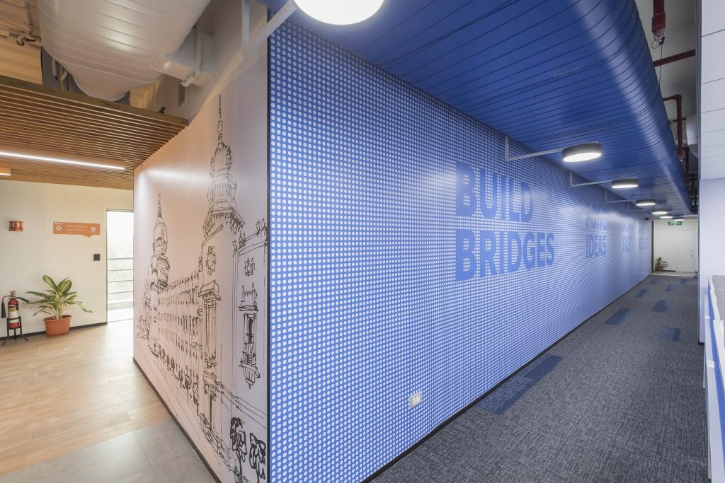
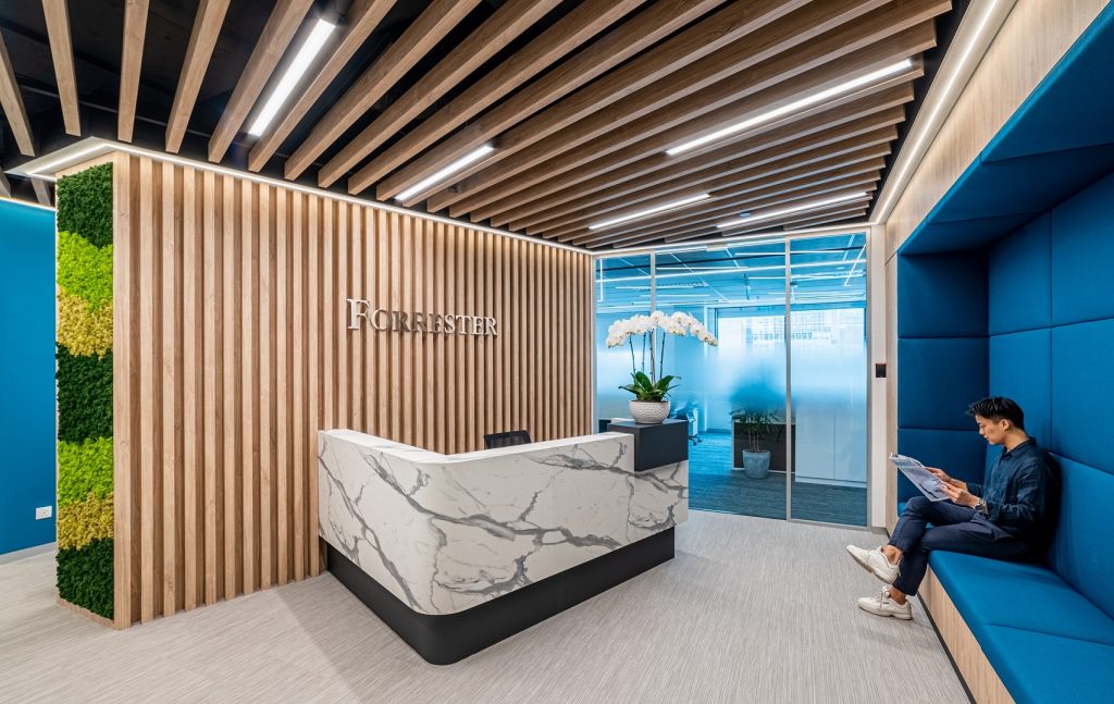
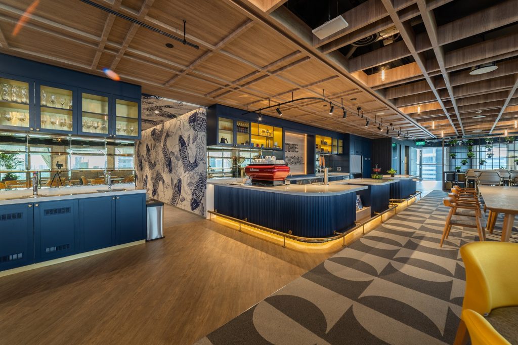
Classic Blue injects creative confidence into interiors, transmuting a space through unique color combinations and tonal statements. Easily applied across so many different textures, materials and finishes, Classic Blue is a dependable blue that can take you in many different directions, expressing convention and grace, as well as bewildering boldness. Let us go through some spaces of how it can be used, it may not be limited to just home decor, it can also be used offices, restaurants and cafes, companies in medical and pharmaceutical sector and in many other spaces as seen in the pictures below:
Classic Blue as Home Decor
1.Wall Paint
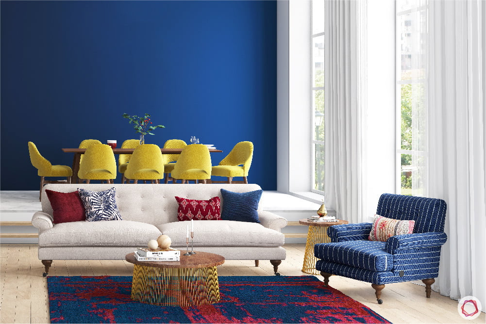
There are many ways how we can use Classic Blue in a home decor. It is perfect for using for smaller rooms, as dark walls have the effect of making small space seem larger, while at the same time it can draw people in and highlight the other objects in the room. It’s a very chic choice when paired with neutral light walls. Any amboree space, like a dining room or living room, really benefits from this palliative shade.
2.Soft Furnishings
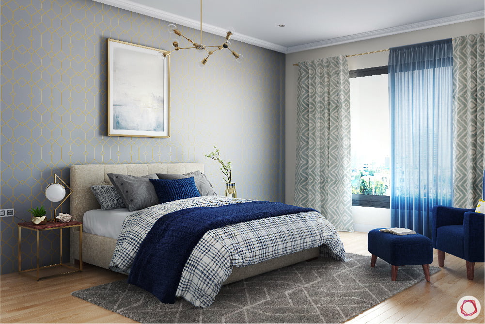
If it is not used as the primary color for the room, it works great as an accent. Which could be in the upholstery, wallpaper or soft furnishings. There are so many things which could be changed in a room without major makeovers such as cushions, blinds and curtains, rugs and carpets, frames and so on.
3.Kids Room
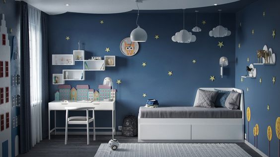
Bright colors when used with the Classic Blue can go very well with kids’ room. Classic Blue pairs well with a variety of colors, especially bright whites, yellows and greens and pastels.
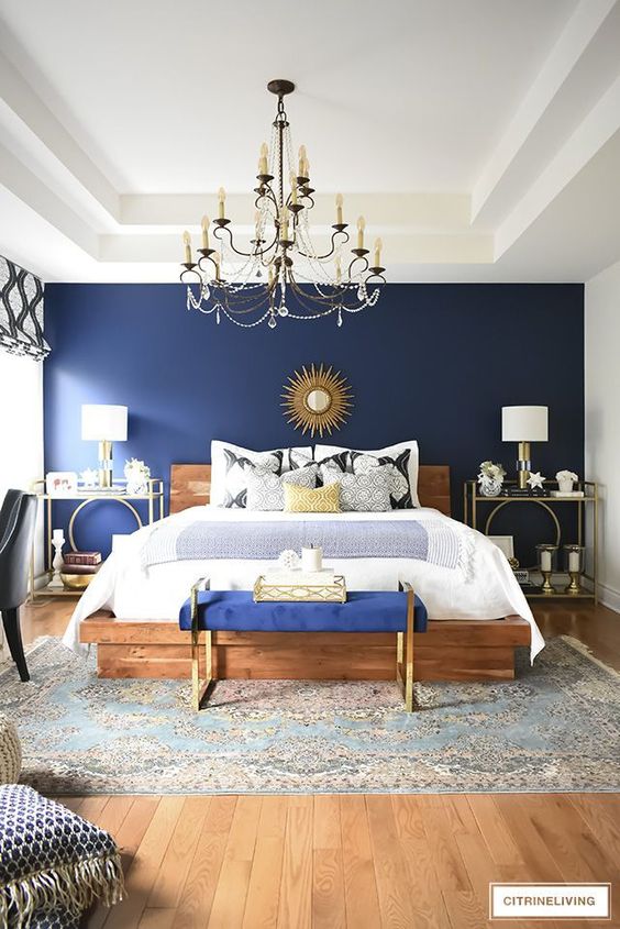
4.Headboard
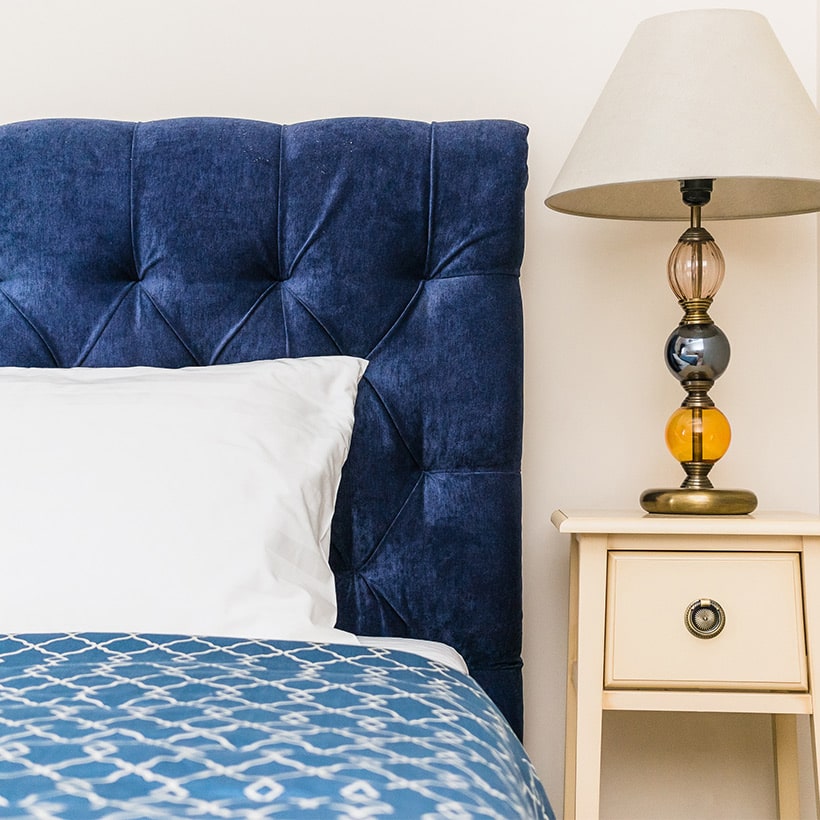
Adding a headboard can totally transform the look and feel of the bedroom in an instant and it’s quite simple too. We can see the bedroom looks royal and superlative with this easy trick.
5.Accessories
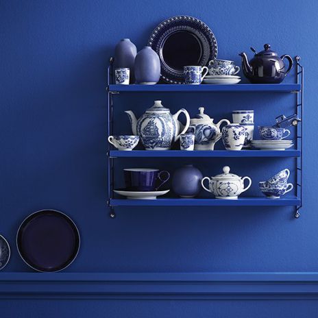
Splashes of blue can be incorporated in the spaces by adding many blue accessories such as pots and crockery. Also blue ceramics are more global in appeal and can add to the heterogeneous mix of decor items in your home. Frames and light fixtures are suitable options as well
6.Cabinetry
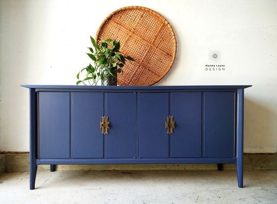
Classic Blue can be paired with many colors. Pastels add a touch of gentleness to the dramatic blue, giving the space a perfect balance of masculine and feminine. The dull cabinets can have a makeover with Classic blue color which will make it stand out glaringly as a statement design.
7.Kitchen Cabinets and Tiles
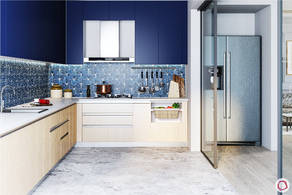
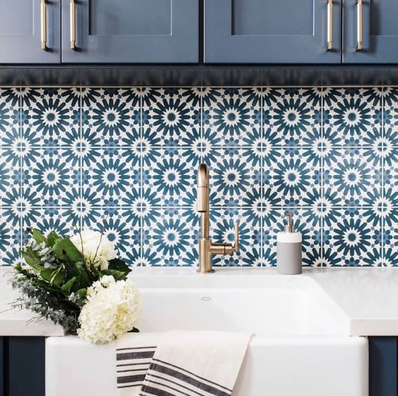
Colors from the classic blue family are a rather safe bet for kitchen cabinets. Firstly, it’s a dark colour that will not stain easily. Secondly, you can match it with any light coloured tiles for a contrast. This rich shade of blue has fared quite well for tiles in design. In the kitchen, solid blue tiles will look remarkable with white cabinets. Alternatively, blue hued Moroccan tiles can be used for avowal highlight flooring.
8.Blue Themed Rooms
The unique feature of this particular shade of blue is whether you use too much or too little, the effect never goes unnoticed. And if you make this the overarching theme of a room, there is no fear of going overboard. Pick a pretty shade of blush pink or peach to go with classic blue. And you will be sorted with a room that is passionate and romantic in equal measure.
Adding Classic blue into your space, either as an accent or a statement, will not only look great, but also sets the vibe and tone of the space. The colour of the year is very resourceful and versatile for everyone to incorporate it into their home interiors in multiple ways and blend into any decor style.
- Category :
- Type :
Created
April 20, 2020
Recent Comments